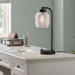


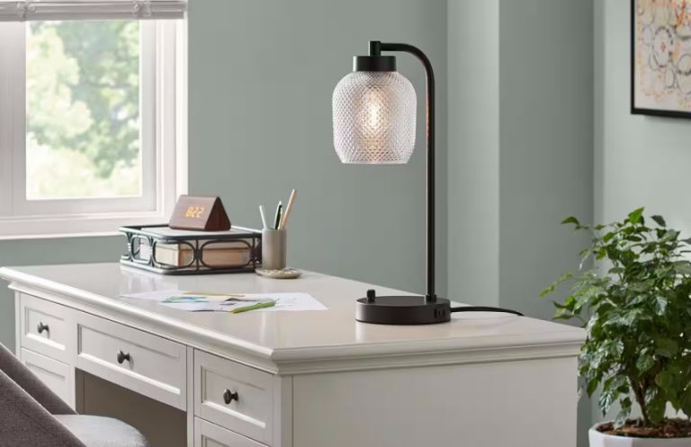


Table lamps come in a wide range of styles, from modern and minimalist to vintage and ornate....
Homeowners can control lighting, heating, and appliances from their smartphones or tablets, making it easy to manage...
Identifying the primary purpose of the lamp is essential. Consider where you plan to use it and...
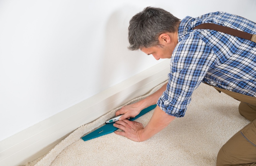
Various materials are used for carpet padding, with foam and rubber being the most common choices. Foam...

Consider factors such as the type of fiber, pile height, and carpet style. Different fibers like nylon,...
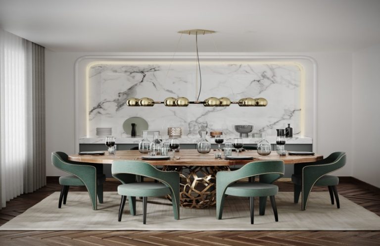
The design of dining chairs can vary greatly, from traditional wooden styles to modern upholstered options. A...

Researching appliance reviews allows consumers to compare different brands and models effectively. Many reviews include side-by-side comparisons...
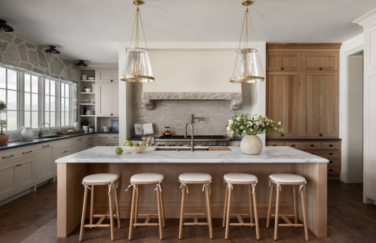
Unlike traditional dining chairs, bar stools are typically taller and more compact, making them ideal for smaller...

Choosing materials that are renewable and responsibly sourced is a key aspect of sustainability. Bamboo, for instance,...

Regular cleaning is essential for all appliances, as dirt and grime can accumulate and hinder performance. For...